Pizza Azteca
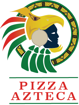
Logo Design
The design for Pizza Azteca incorporates an Aztec warrior along with traditional Mexican colors and patterns. The circular shape behind the Aztec warrior is applied to symbolize the shape of a pizza.
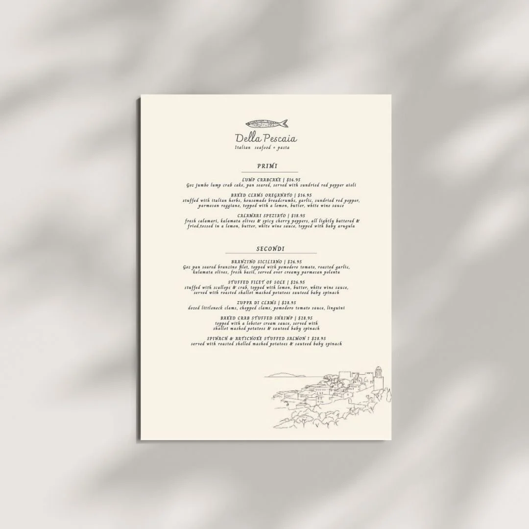
A simple and elegant seafood restaurant menu inspired by the Italian coast. The design features a custom fish logo and a subtle outline of the coastline, creating a clean visual identity that reflects the restaurant’s coastal setting and fresh seafood concept.
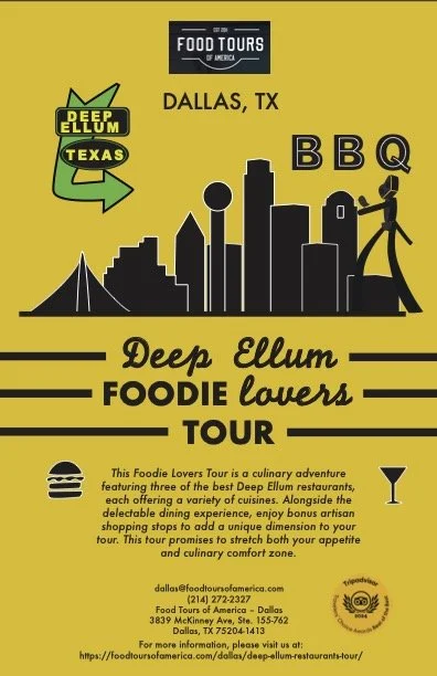
The Foodie Lovers Tour is a Dallas-inspired culinary experience designed to showcase the vibrant flavors of Deep Ellum. The flyer combines the iconic Dallas skyline with bold, inviting visuals and key tour information, highlighting a curated experience featuring three standout Deep Ellum restaurants. The design aims to capture the energy of Dallas while creating an exciting, food-focused experience for visitors and locals alike.
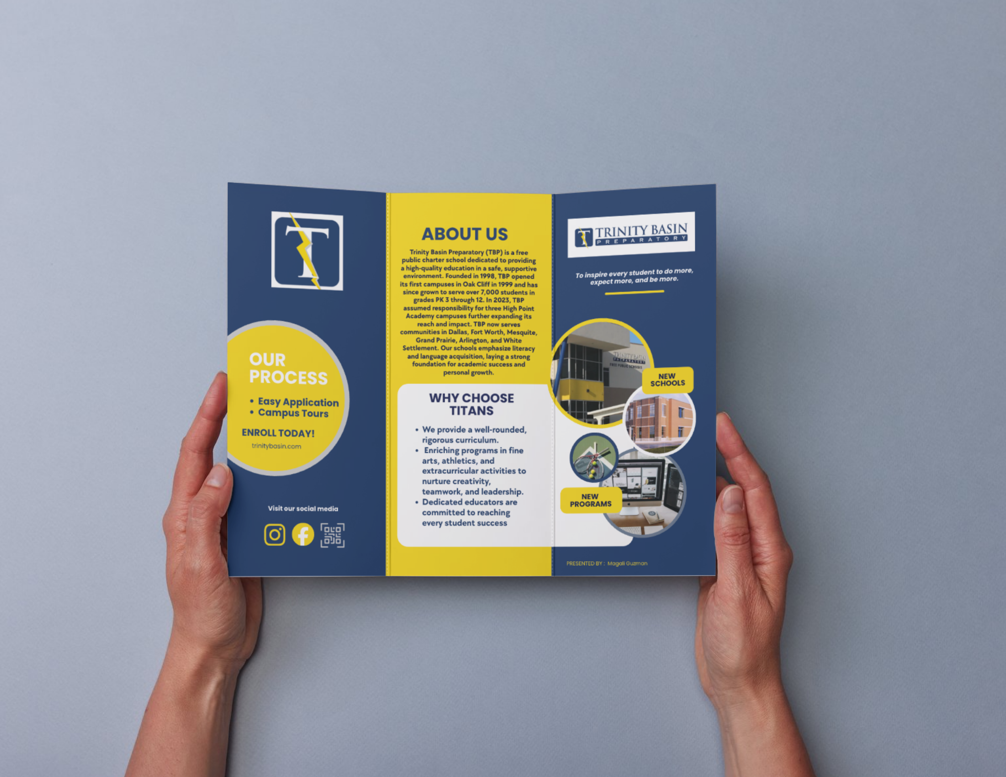
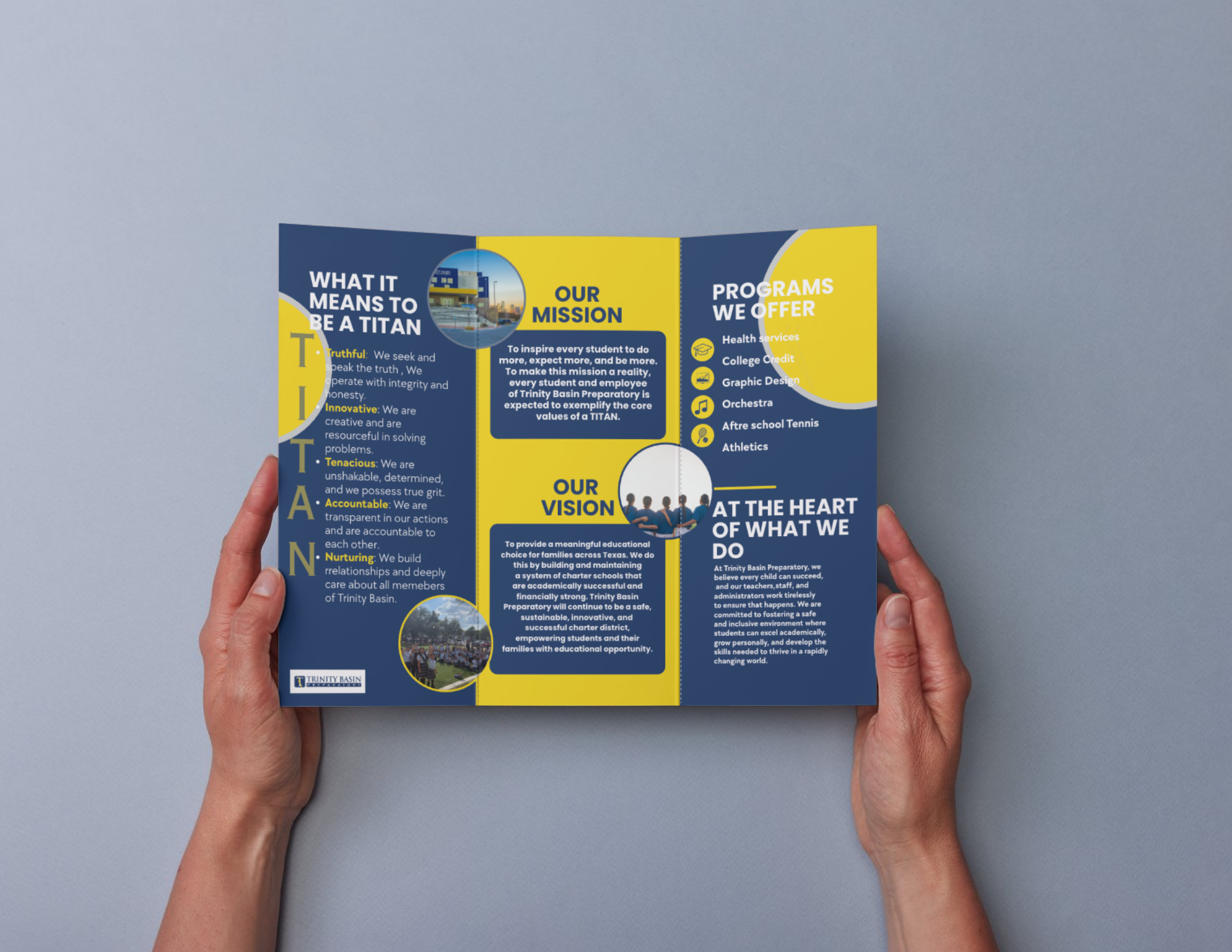
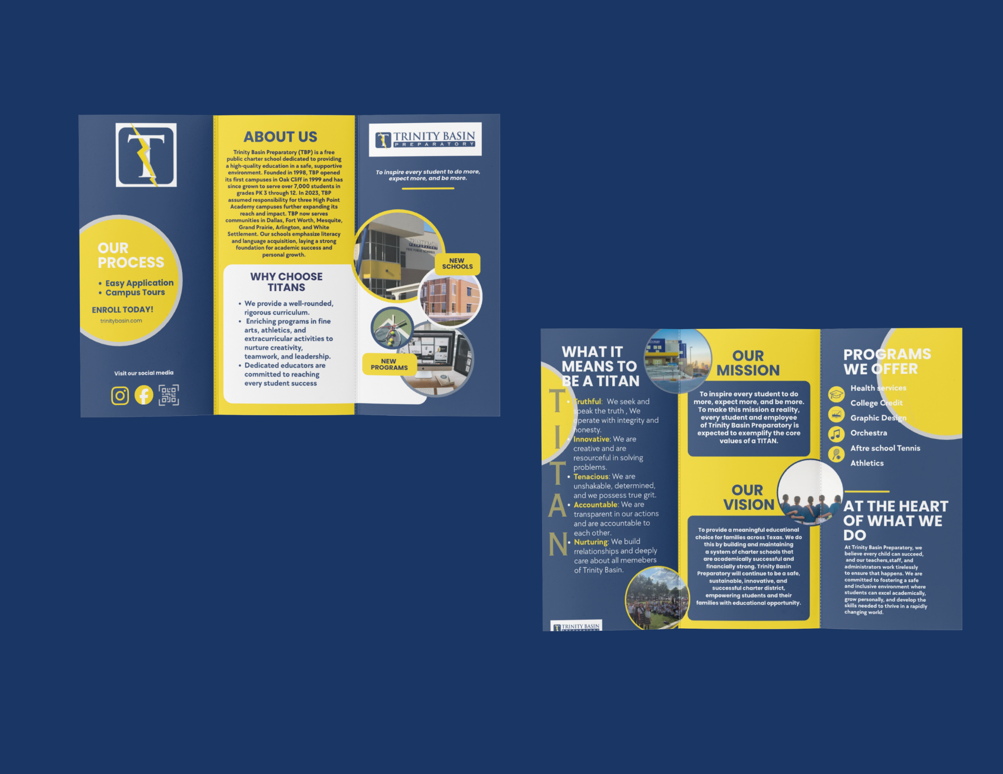
This charter school brochure was designed to clearly communicate the school’s mission, programs, and key information in a welcoming and professional format. I incorporated the school’s signature blue and yellow color palette to create a cohesive visual identity while using clean layouts and engaging design elements to make the information easy to navigate. The overall design balances professionalism with an approachable feel that reflects the school’s community and educational environment.
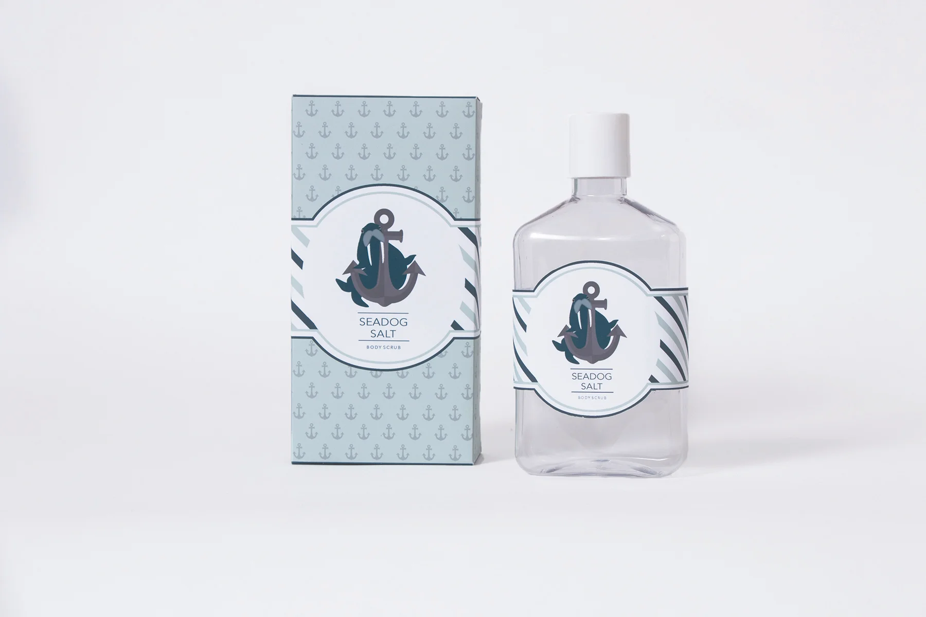
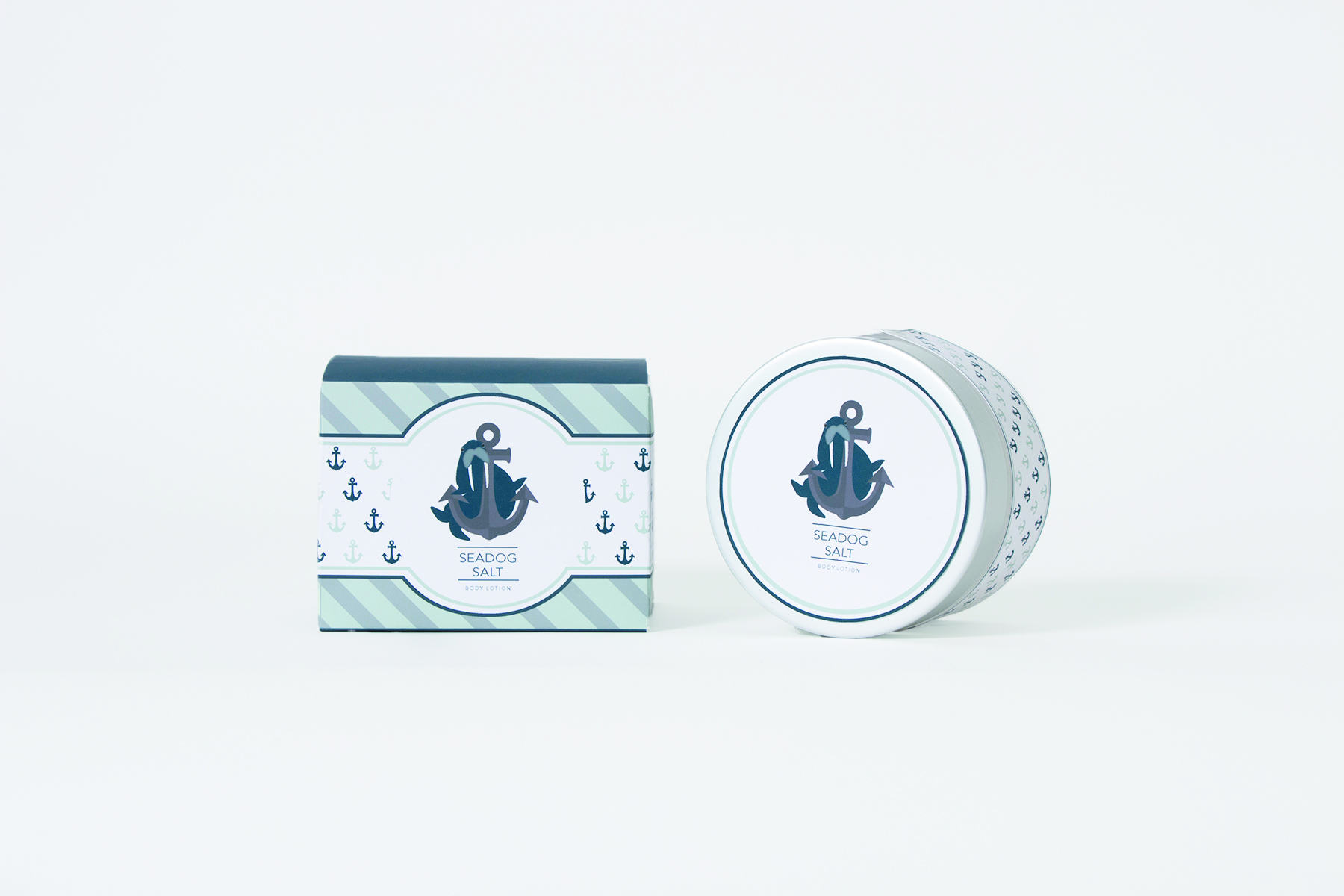
The concept behind Seadog Salt Body Scrub and Body Lotion, mixes patterns, a crisp white and aquatic colors to recreate the sensation of being seaside. The walrus and anchor add a playful nautical element.
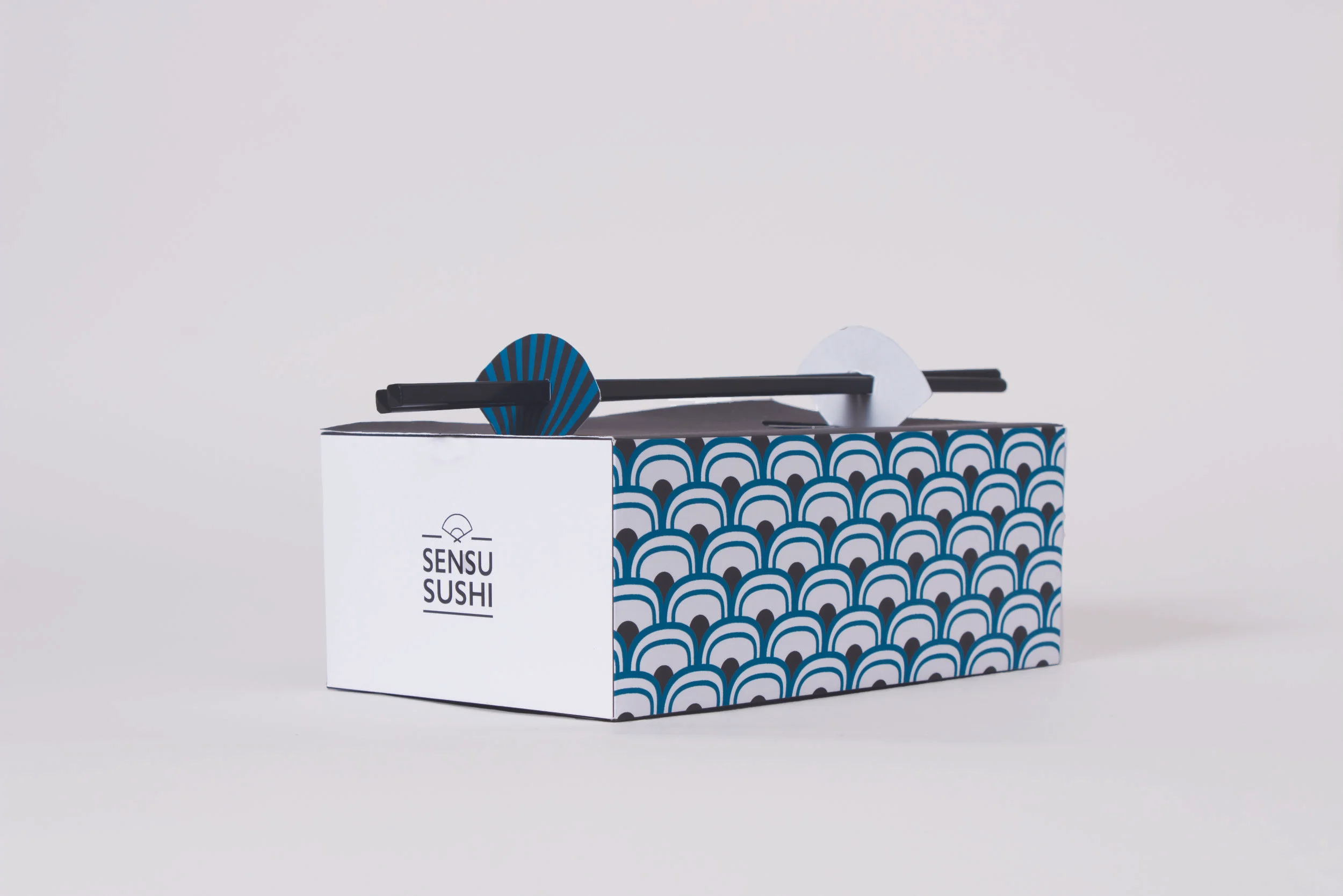
The design for Sensu Sushi “to go” box incorporates japanese influenced shapes, patterns and colors. The word “Sensu”, means a japanese traditional fan and it is also applied for the shape of the handles making it simple for users to hold on to.
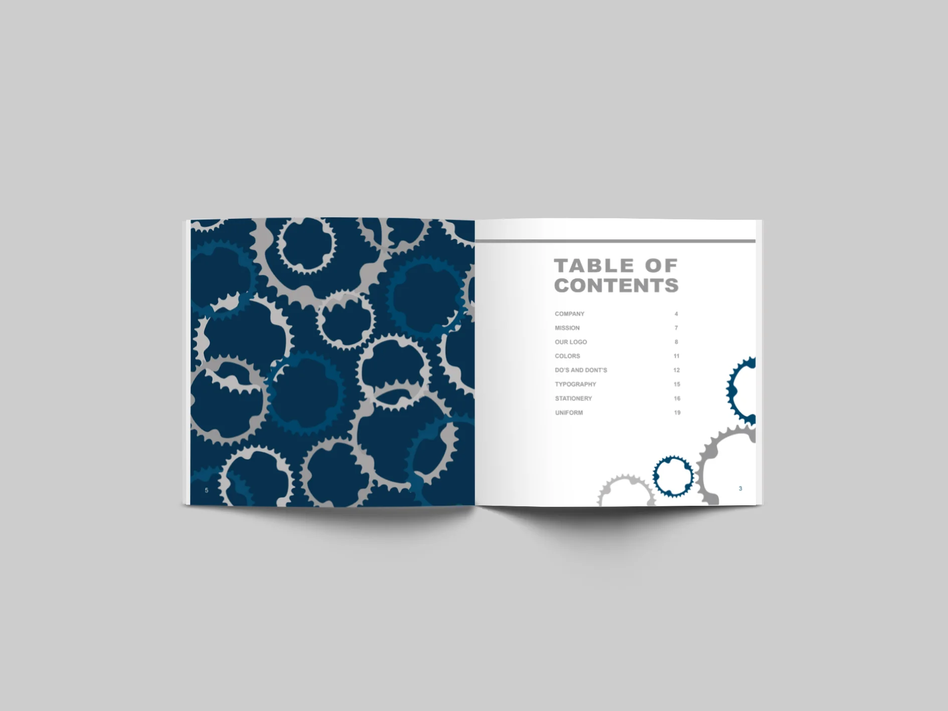
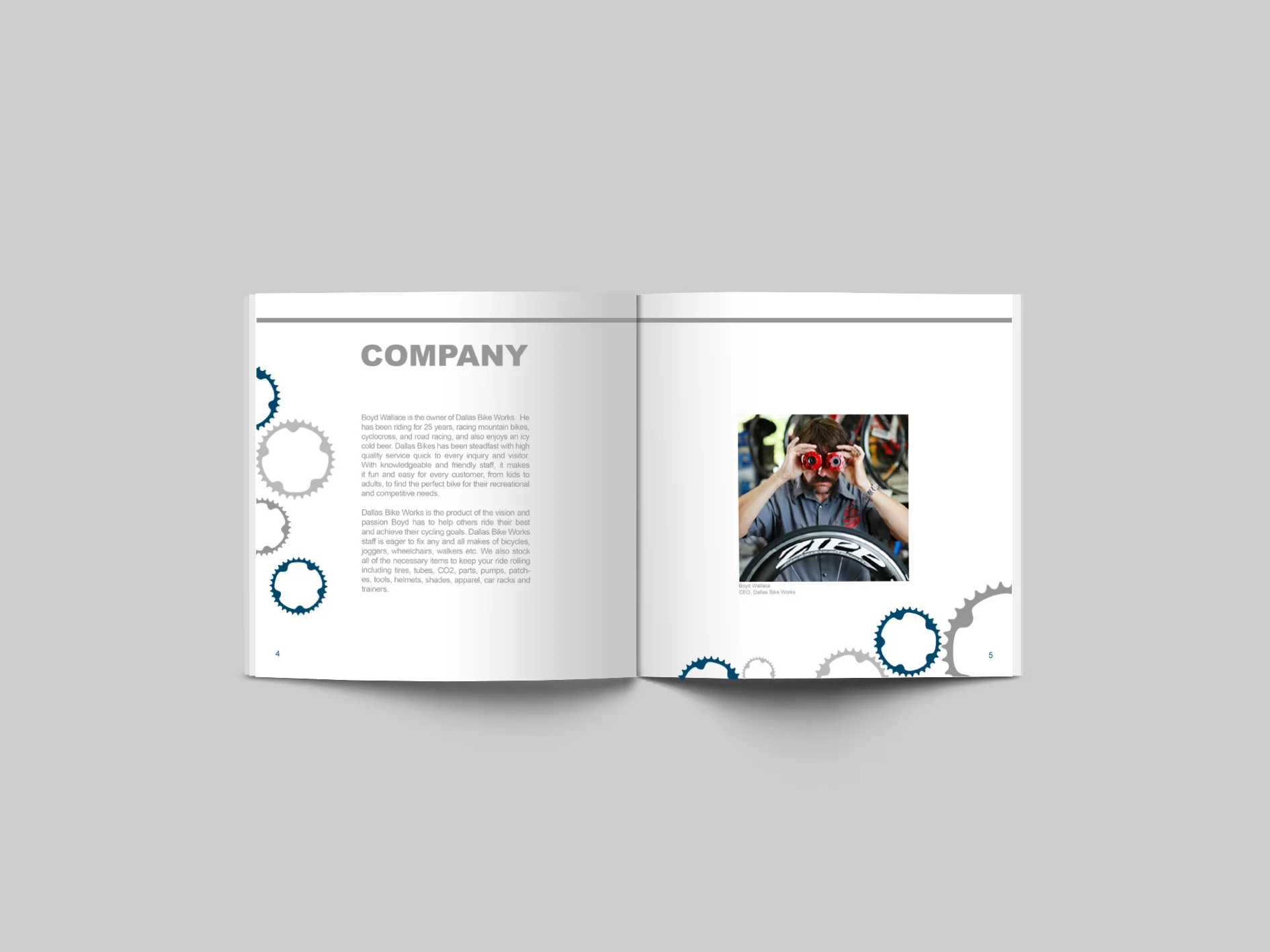
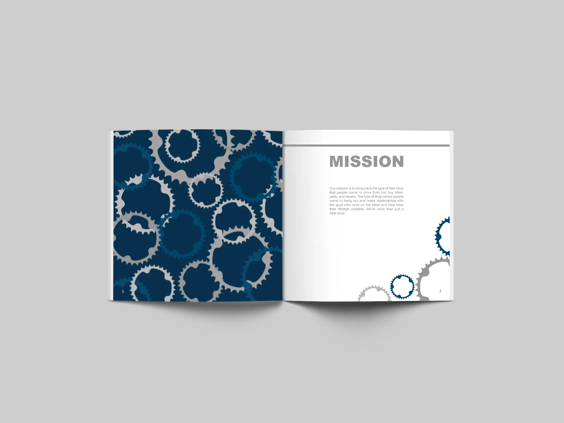
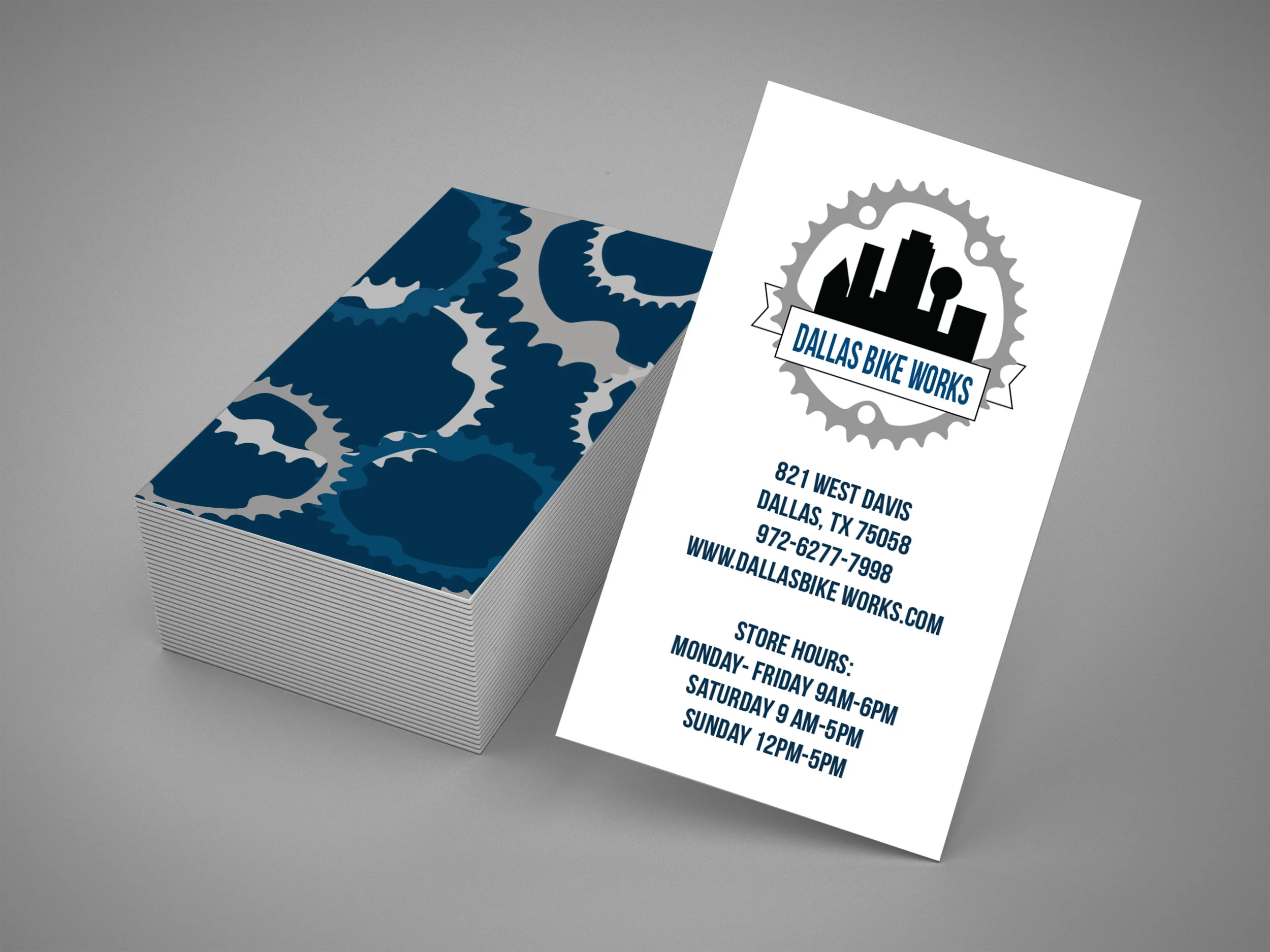
This brand identity book was created for Dallas Bike Works, a local Dallas cycling business. The design combines blue and gray tones with cycling-inspired visuals to create a modern, cohesive brand identity. The book highlights the company’s mission and brand personality while showcasing typography, stationery, uniforms, and bike gear to demonstrate how the identity can be applied consistently across different materials.
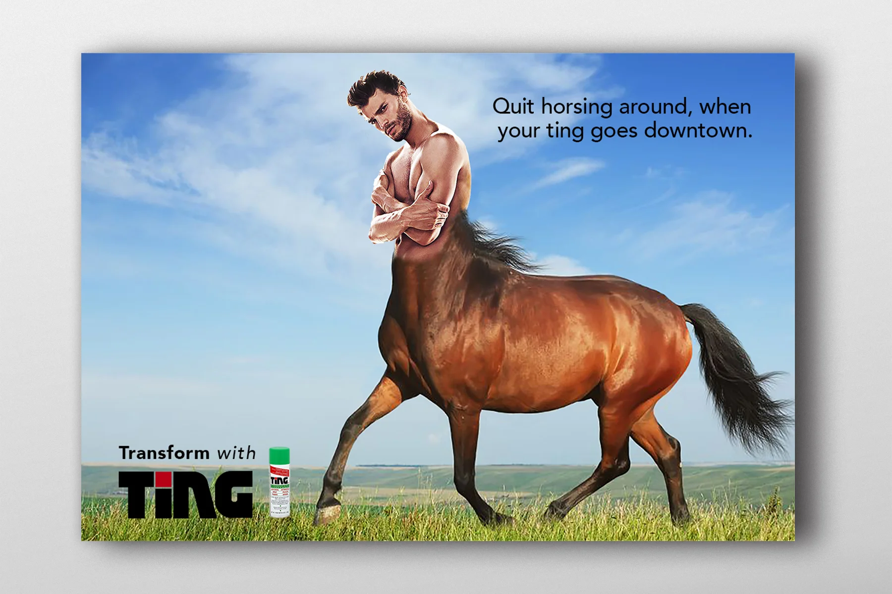
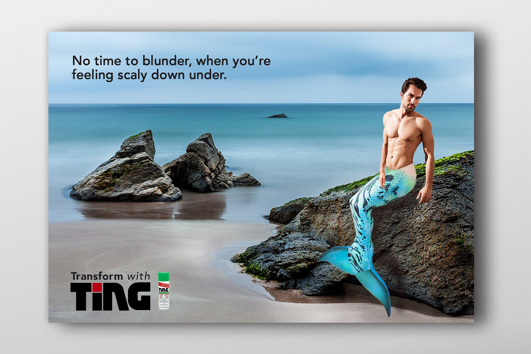
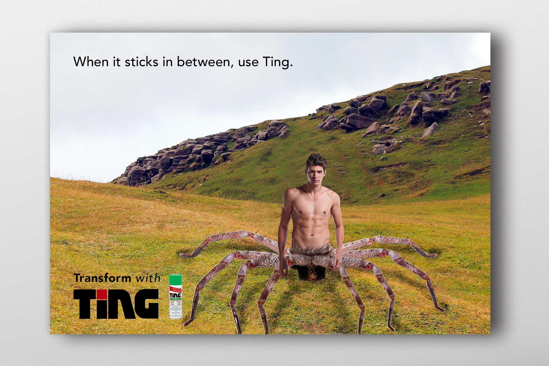
This “nightmare” advertising campaign was assigned as a collaborative group project for the anti-fungal jock itch spray Ting. Strong concepts using humor and euphemisms for physical areas of discomfort, this campaign targets males ages 18 to 45.
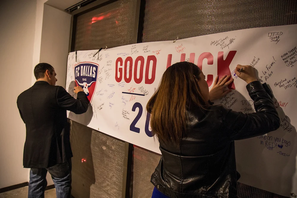
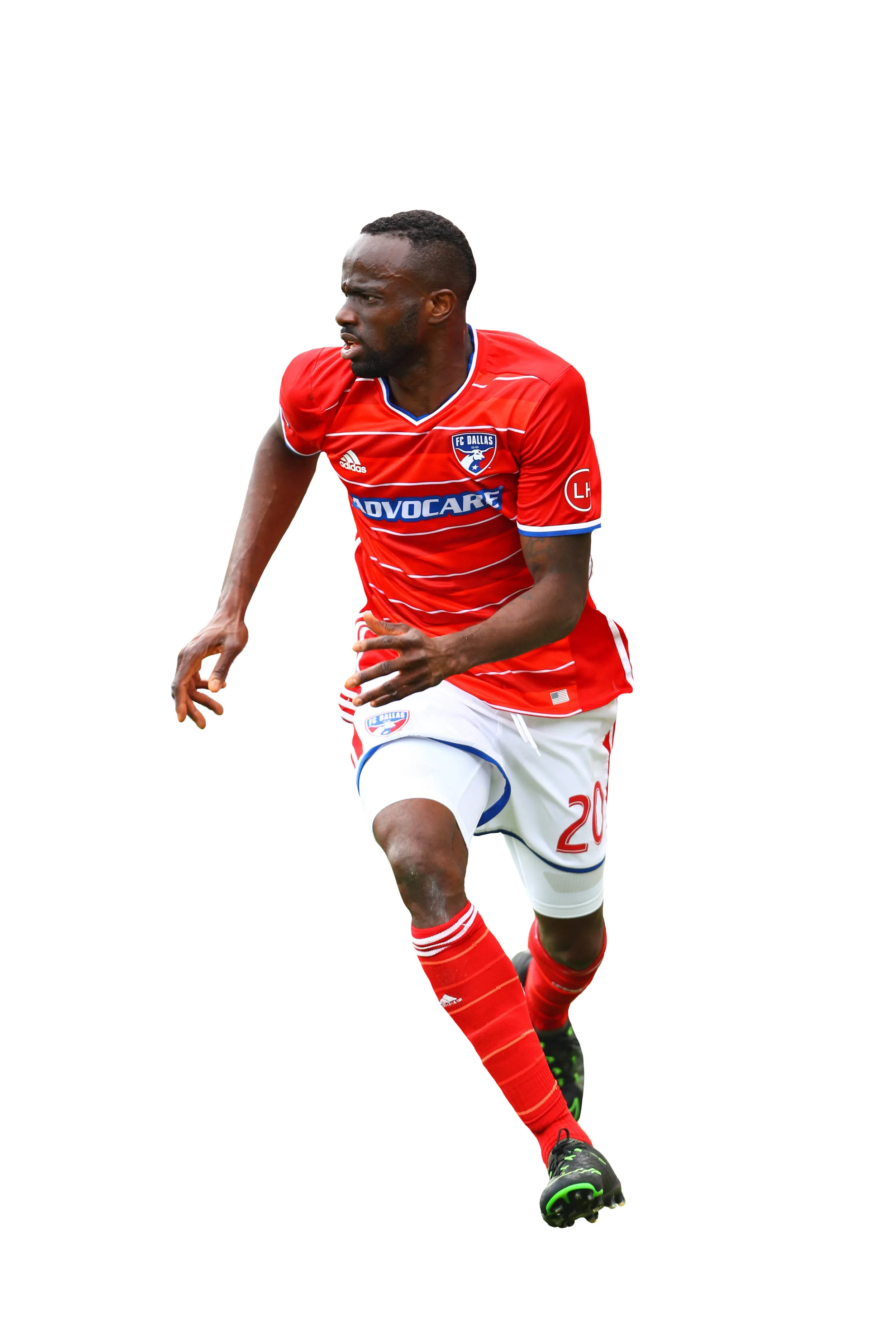
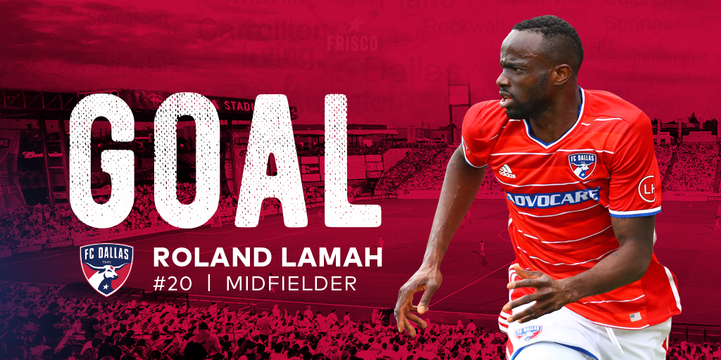
Designed a “Good Luck” banner for an FC Dallas event, creating an interactive piece where attendees could sign their names and leave their mark. I also created custom Photoshop cutouts of soccer players for digital banners displayed during matches, combining dynamic imagery with team-focused visuals to enhance the in-stadium experience.
The good luck banner purposed fan signatures during the FC Dallas soccer player award recognition.